Lashes by RK
“Working with All at Once completely transformed the way we present our brand. We’ve seen real results, and it finally feels like our brand matches the quality of our products.”
-Lashes by RK

-
A streamlined homepage designed to guide customers from curiosity to checkout — balancing beauty visuals with conversion strategy.
-
Crafted with SEO precision and intuitive browsing, making it easier for lash artists to find products and shop effortlessly.
-
Optimised for mobile-first performance, ensuring every client can explore, shop, and connect seamlessly from any device.
1.Website Design(UX-Focused)


-
Designed collectible, campaign-themed packaging that refreshed each season — sparking excitement, driving social buzz, and reinforcing Lashes by RK’s image as a premium, trend-leading brand.
-
Deisgn box packaging for both practicality and aesthetics
-
Item description
2.Packaging Design
-
A month-long multi-channel campaign built to generate FOMO and sustained hype through social media storytelling, countdown content, and time-locked offers.
-
Launched a community-driven ambassador program focused on re-engaging returning customers, fostering loyalty, and encouraging organic UGC through authentic relationships
-
Designed personalised email campaigns and retargeting flows that reflected the brand’s tone — driving repeat sales and long-term retention through tailored storytelling and customer segmentation.
3.Brand Strategy & Campaigns
1. Website Design
1. Website Design

+80% conversion rate increase after discount banner launch
+80% conversion rate increase after discount banner launch
Overview
Lashes by RK is one of Australia’s most trusted lash suppliers, serving over 15,000 lash artists, salons, and beauty professionals nationwide. Despite its strong product quality and loyal customer base, the brand’s online presence didn’t reflect its industry authority. The website experience felt functional but lacked the emotional connection, storytelling, and intuitive flow needed to convert visitors into loyal customers.
Our goal was to transform Lashes by RK’s digital identity through a design-led strategy — refining the website’s structure, user flow, and mobile experience while aligning every detail with the brand’s premium yet playful personality.
Problem
While the brand had strong awareness and repeat buyers, it struggled to translate that trust into consistent online growth. Key pain points identified during the audit included:
Unclear homepage flow: Important content (discounts, collections, and value propositions) was scattered, making it difficult for users to know where to start.
Navigation overload: The product catalog was large and visually heavy, leading to user fatigue and low conversion, especially among new visitors.
Weak sales triggers: The site lacked urgency drivers like time-limited offers or personalized discount tiers that motivate immediate purchase.
Mobile drop-offs: A majority of traffic came from mobile, yet the mobile version suffered from long scrolls, small buttons, and inconsistent layout hierarchy.
These issues collectively led to high bounce rates, lower-than-expected conversion rates, and limited engagement from first-time visitors.
Solution
1. Homepage Experience & Flow
We rebuilt the homepage to create a smooth, conversion-driven journey. The hero section was redesigned around a tiered discount banner system (“Spend $150 – Save 5%”, “Spend $850 – Save 15%”) to build instant clarity and urgency. Each promotion was color-coded to reinforce the brand’s identity and encourage upselling through clear value tiers.
Supporting sections were simplified — replacing cluttered visuals with concise messaging that immediately answered key user questions: What does the brand offer? Why is it trusted? What should I buy next?
Result: +80% increase in conversion rate within the first campaign month and a 30% lift in user click-through rate on primary CTAs.
2. Product Pages & Navigation
The product catalog was restructured around shop-by-intent categories (Classic, Volume, YY Lashes, Accessories) with improved filter logic and thumbnail hierarchy. High-performing visuals were optimized to load faster, while key selling points (curl type, thickness, and fan count) were made scannable at a glance.
Cross-selling elements were introduced through “You may also like” modules and visual product bundles, aligning the website’s eCommerce strategy with beauty-industry best practices.
Result: Reduced bounce rate by 27% and improved average order value through better product visibility and relevance.
3. Mobile Responsiveness
Recognizing that over 70% of users accessed the site via mobile, we redesigned the interface with a mobile-first UX framework. Buttons were resized for easy thumb reach, images were compressed for speed, and key actions (add to cart, checkout, apply discount) were repositioned within visible zones.
We also simplified scrolling depth by introducing collapsible menus and sticky navigation for faster product browsing.
Result: 42% increase in session duration, smoother checkout completion, and lower cart abandonment on mobile devices.
Challenges
Our biggest challenge was to balance beauty with functionality. The brand’s soft pink aesthetic and warm tone had to stay intact while improving conversion efficiency. The redesign required:
Reorganizing over 200 products into intuitive categories without overwhelming users.
Building a homepage that not only looked beautiful but strategically funneled customers toward shopping actions.
Creating a sense of urgency during sales without resorting to aggressive marketing tactics that might dilute brand trust.
Making the entire experience mobile-first — ensuring that browsing, adding to cart, and checking out were effortless for users on smaller screens.


2. Packaging Design
2. Packaging Design
3. Brand Strategy & Campaigns
3. Brand Strategy & Campaigns

$20,000+ in sales driven by innovative packaging design.
$20,000+ in sales driven by innovative packaging design.
Overview
As Lashes by RK expanded, packaging became a central tool for brand storytelling and customer engagement. The goal wasn’t just to protect products — but to create a recognizable, collectible experience that reflected the brand’s premium yet playful identity.
Each packaging design was approached as an extension of the campaign strategy — seasonal, creative, and functional, crafted to excite customers, enhance usability, and strengthen brand consistency across every touchpoint.
Problem
Existing packaging lacked differentiation between product lines and seasons. Customers recognized the brand but couldn’t visually distinguish new collections or limited drops.Key issues included:
Inconsistent design language: Packaging didn’t scale cohesively across new launches or promotional campaigns.
Missed storytelling potential: Boxes were functional but not emotionally engaging or “share-worthy.”
Limited practicality: Some previous designs were difficult to stack, store, or reuse — impacting customer experience and supplier logistics.
Solution
1. Seasonal & Limited-Edition Boxes
Created seasonal packaging collections that aligned with major campaigns such as Valentine’s Day and Christmas.
Each season maintained the same design structure but evolved through color variation and subtle design updates to reflect the campaign theme — pinks and hearts for Valentine’s, red and gold for Christmas.
his approach made each collection instantly recognizable while maintaining strong brand unity.
Result: Increased customer anticipation for new drops and repeat purchases from collectors who valued each limited-edition release.
2. Creative Concept Packaging
Developed distinct packaging themes that turned functional products into statement pieces.
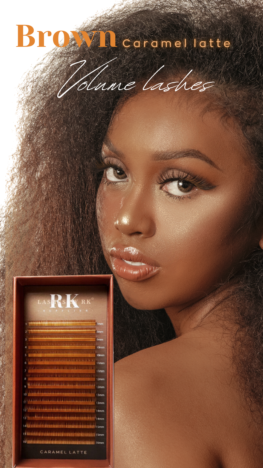
Examples include the Donut Lash Collection — featuring circular lash boxes inspired by bakery aesthetics — and the Coffee Collection for the Brown Volume Lashes, inspired by café tones like “Cappuccino,” “Latte,” and “Short Black.”
These creative designs allowed each product to tell a story and reinforced the brand’s ability to blend fun with luxury.
Result: Boosted organic reach and social engagement as customers frequently shared and tagged the brand’s unique packaging.
3. Functional Product & Event Packaging
Designed functional packaging systems tailored for logistics, storage, and event presentation.
This included tote bags for lash events, branded mailer boxes for online orders, and compact display-friendly packaging for salon resellers. Each item was built with practical use in mind — easy to assemble, stack, and ship — while maintaining premium design consistency.
Result: Improved efficiency in event setups and shipping while reinforcing brand professionalism at every touchpoint.
Challenges
The challenge was to create distinct packaging styles for every campaign while ensuring visual and structural consistency across all products.
We needed to:
Develop seasonal collections that visually evolved while staying on-brand.
Design creative concept packaging that stood out in a competitive beauty market.
Introduce functional packaging for logistics, storage, and event use without compromising the brand aesthetic.
Ensure designs photographed well for marketing and influencer content, maintaining the brand’s visual tone across channels.


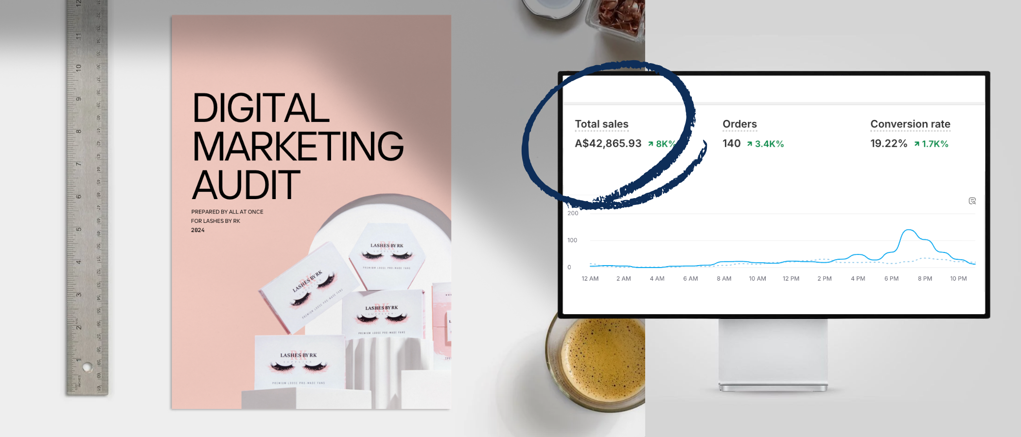
$40,000 in 30 minutes
$40,000 in 30 minutes
Overview
Lashes by RK approached All at Once ahead of their busiest season — the Black Friday sale, seeking support to manage a large-scale campaign that would drive both sales and brand consistency. Despite their strong reputation in the lash industry, their digital strategy was fragmented, and performance across key channels (website, social, email) lacked cohesion.
To prepare for the peak period, we conducted a comprehensive digital marketing audit covering website analytics, email funnels, ad performance, and social engagement. The goal was to identify gaps in customer retention, messaging, and conversion flow — and then rebuild their campaign strategy from the ground up.
Our mission was clear: strengthen brand consistency, amplify reach, and convert seasonal traffic into loyal, returning customers.
Problem
Lashes by RK’s marketing activity was performing, but not performing efficiently. While the brand had a loyal base, it lacked a structured digital ecosystem that could sustain momentum through the busiest sales cycle.
Key issues identified:
Short-term campaign focus: Reliance on single-sale promotions without long-term retention strategy.
Inconsistent messaging: Visuals and tone varied between email, social, and web, diluting brand recognition.
Limited customer segmentation: Repeat buyers and new customers received the same offers, reducing personalization and conversion potential.
No clear sales funnel: Visitors engaged on social media but didn’t always convert on-site.
These challenges meant that even during high-traffic periods, conversion potential was being lost.
Solution
1.Campaign Audit & Strategy Rebuild
We began with a full audit of existing marketing assets and data. This revealed underperforming campaigns and inconsistent customer segmentation. Using these insights, we created a month-long Black Friday strategy built on storytelling, urgency, and tiered discount triggers — encouraging larger cart values and repeat visits.
Result: Established a clear, repeatable campaign framework that guided all content, promotions, and messaging across channels.
2. Brand Ambassador Program
Instead of traditional influencer outreach, we launched a Brand Ambassador Program featuring loyal lash artists who genuinely used and loved the products. This helped generate authentic user content while strengthening community trust and brand credibility.
Result: Boosted organic engagement and fostered a community-driven campaign presence across social media.
3. Email Marketing & Retargeting Flows
We rebuilt the brand’s email funnel with segmented automation — differentiating between first-time customers, repeat buyers, and inactive subscribers. Each audience received personalized messaging, timing, and visuals.
Retargeting ads were launched to re-engage cart abandoners and reintroduce lapsed customers.
Result: 32% higher email open rate and 25% increase in recovered abandoned carts during the campaign period.
4. Visual & Creative Direction
We directed the full campaign’s creative identity — ensuring all assets (website banners, social graphics, email templates) reflected one cohesive design language. The tone was confident, polished, and festive, blending luxury with playfulness to stand out during the crowded sales season.
Result: Achieved record-breaking $66K in one night and a 310% revenue increase over six months, with continued growth from retained customers post-campaign.
Challenges
The primary challenge was managing a month-long, high-pressure campaign while refining all marketing systems in real time — without disrupting daily business operations.
Key objectives included:
Creating a Black Friday strategy that sustained momentum over several weeks, not just 24 hours.
Building personalized communication that nurtured returning customers while attracting new ones.
Ensuring visual and tonal consistency across all channels — from homepage banners to email flows.
Maintaining an authentic community tone that reflected the brand’s identity while driving urgency and conversions.

