TIMBER HUB AU
“All at Once built our brand from the ground up. The attention to detail in our logo, colours, and website design brought our vision to life. Everything feels cohesive, professional, and true to who we are — it’s helped us connect with more clients and elevate our reputation in the industry”
-TIMBERHUB AU

-
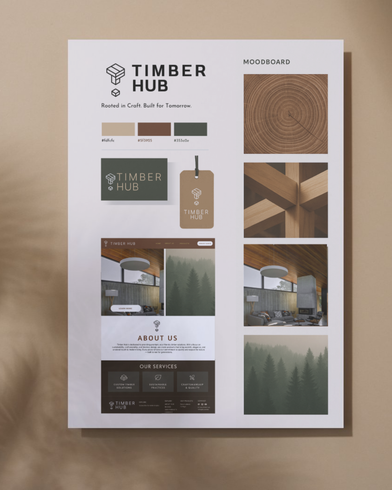
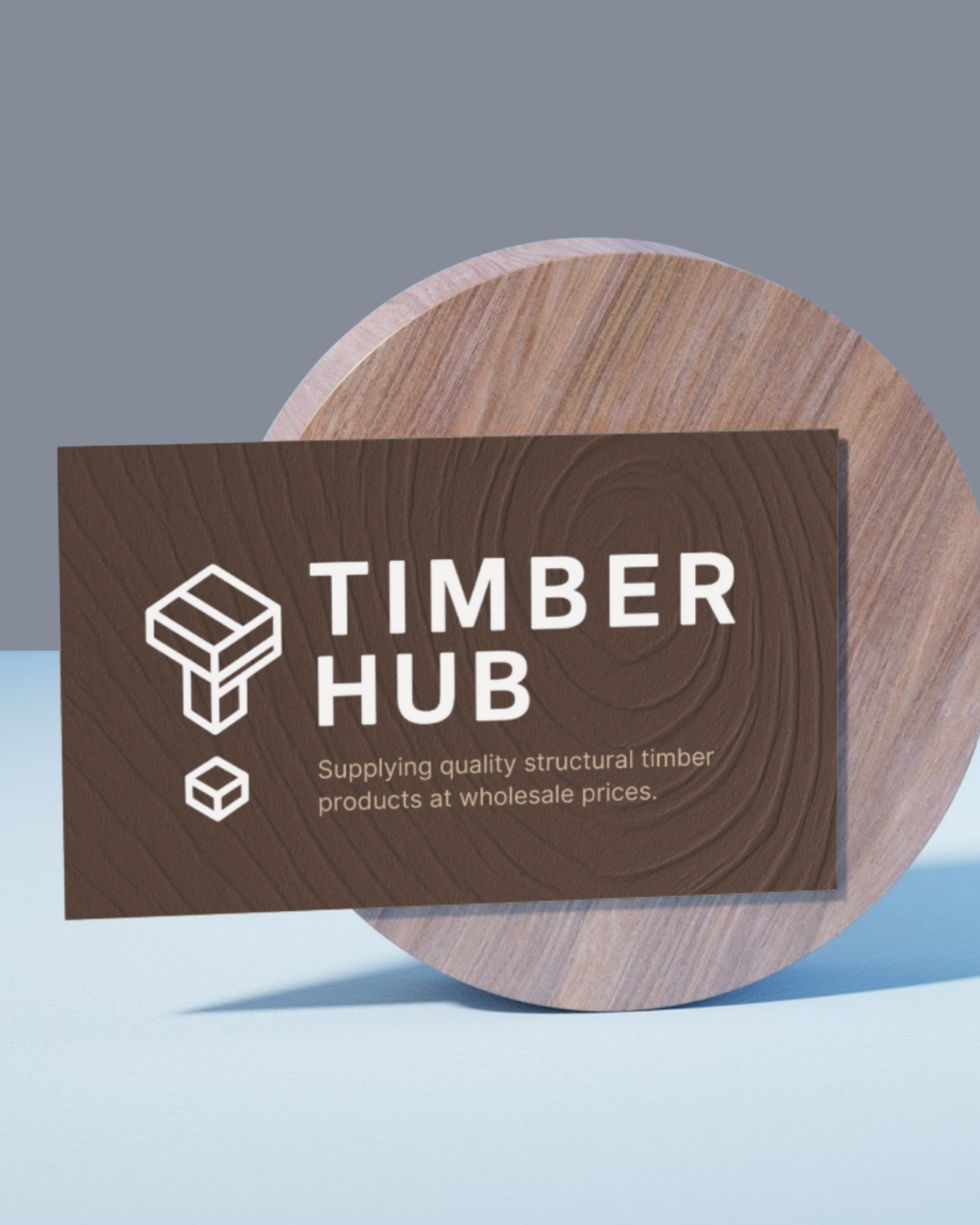
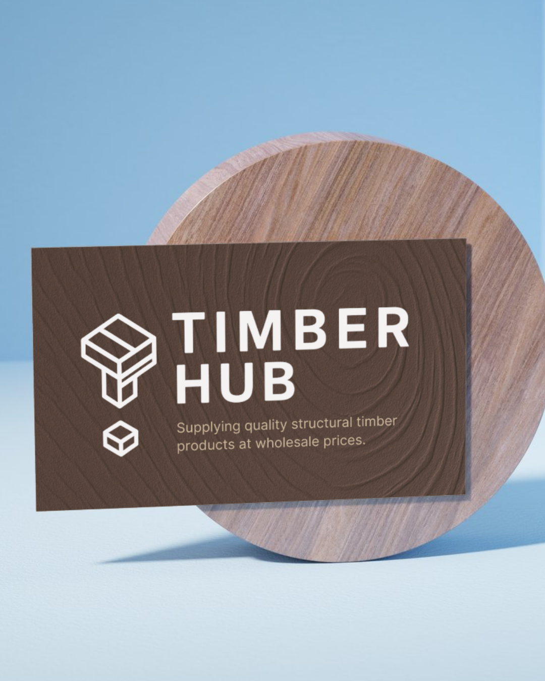
Developed a minimal, geometric logo inspired by timber structures to reflect strength and precision. The visual mark and typography system established a timeless foundation for the brand — bold, clean, and instantly recognisable across all mediums.
-
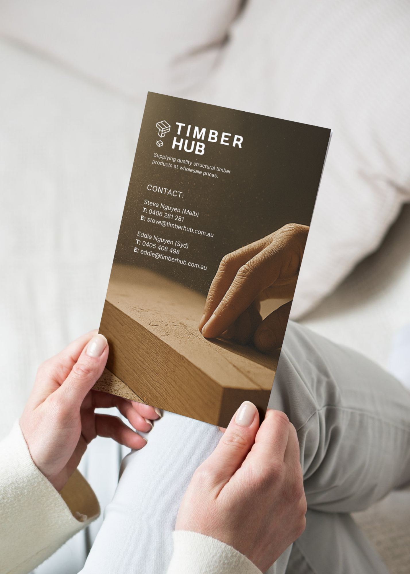
Designed business cards, brochures, and signage that brought the brand’s tone and visual language into physical form. Every printed piece was crafted with clear hierarchy and tactile finish, ensuring Timber Hub presented itself with professionalism in every client interaction.
-
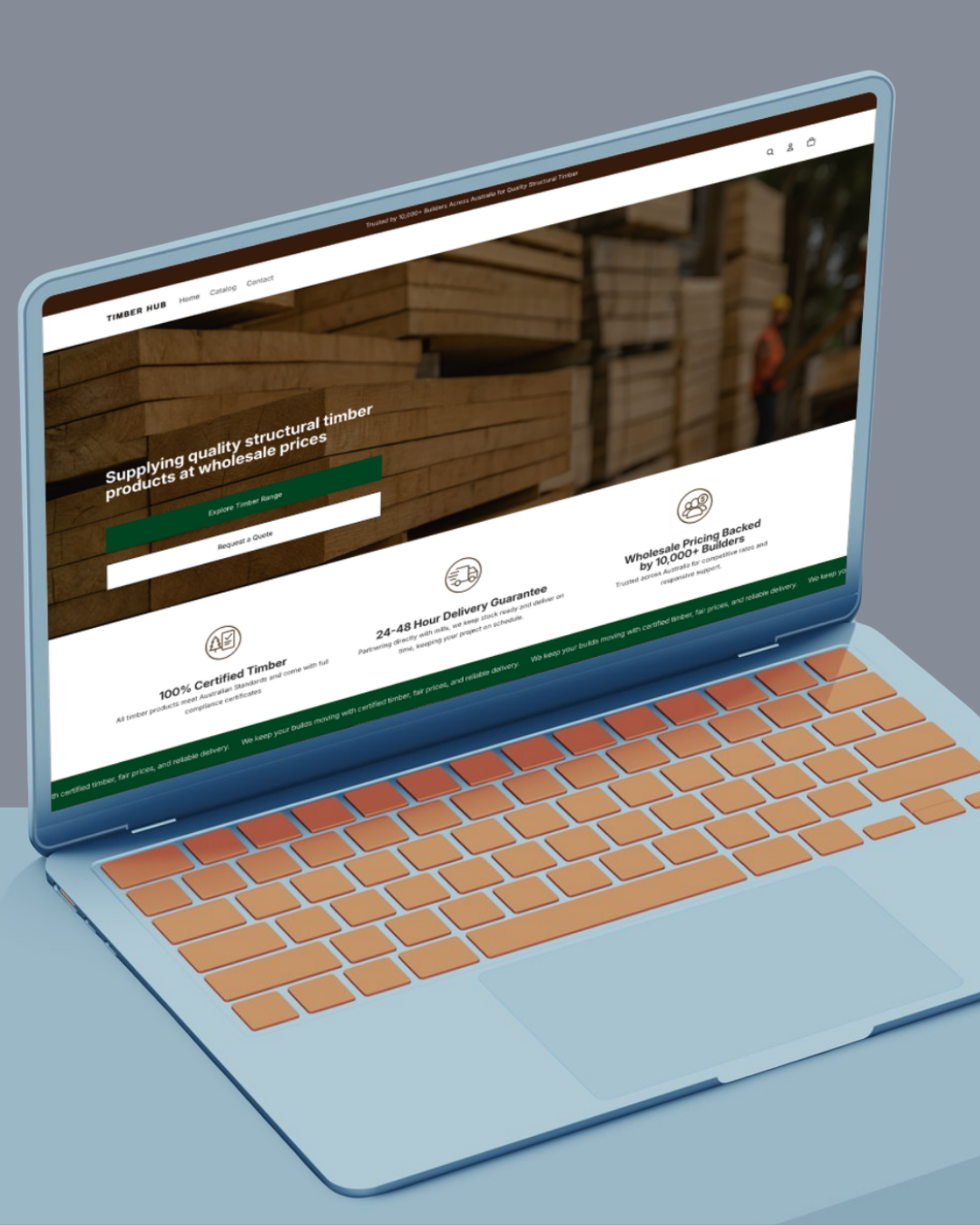
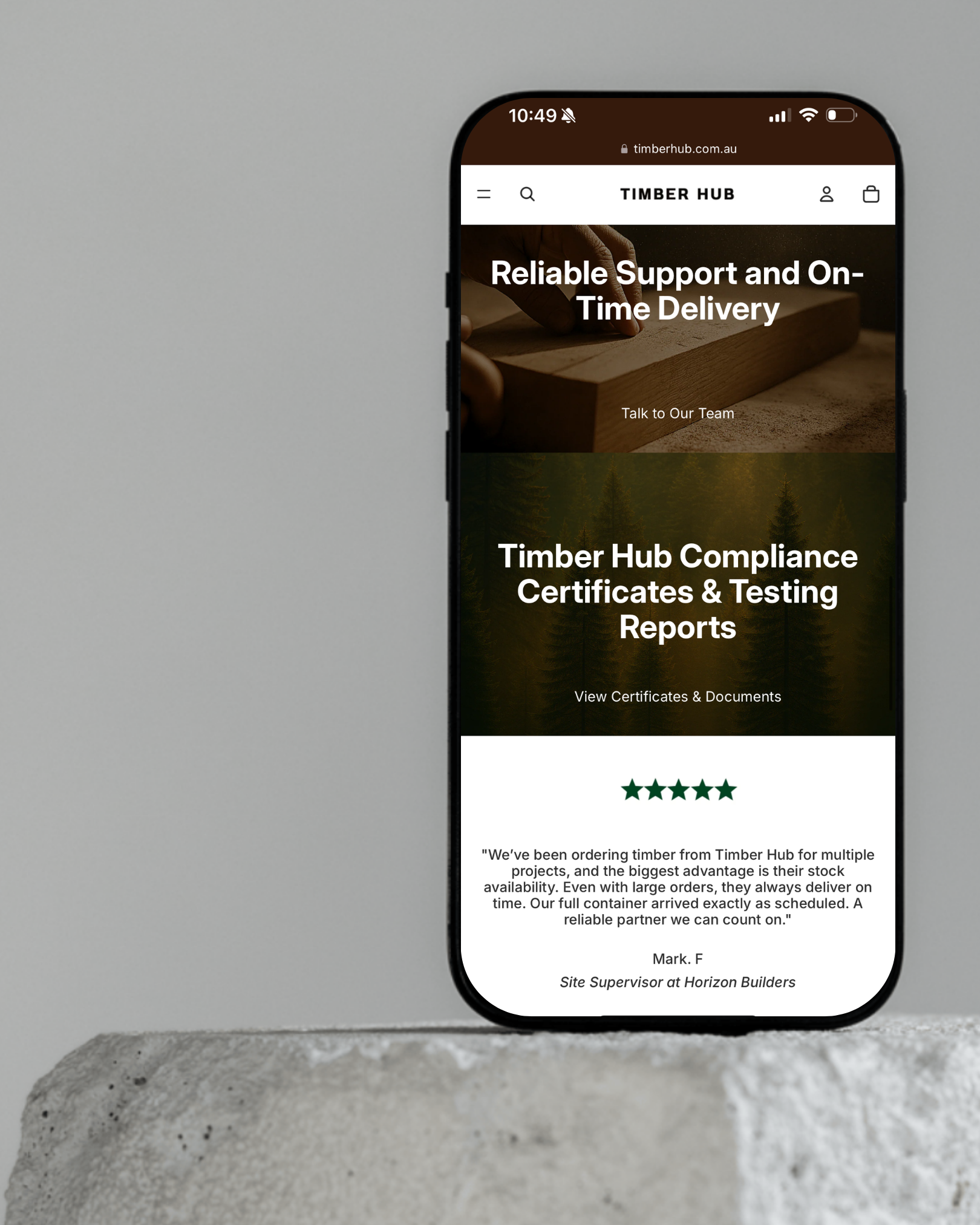
Built a UX-focused website that acts as the hub for brand communication — balancing minimal aesthetics with functional clarity. The layout highlights services, product offerings, and enquiry forms, allowing builders to connect quickly and confidently.
-
Created a neutral, architectural-inspired colour palette built from earthy timber tones, concrete greys, and matte blacks to convey reliability and craftsmanship. Paired with a clean sans-serif typeface, the system communicates both industrial quality and modern design.
Brand Identity & Communication Design
1. Brand Identity & Communication Design
1. Brand Identity & Communication Design
Timber Hub was a new supplier in the construction sector that needed to establish a strong, trustworthy brand presence. With no existing identity or digital foundation, their challenge was to compete with established suppliers while communicating reliability, professionalism, and design quality from day one.
Overview
When Timber Hub approached All at Once, they were a newly established supplier in the construction sector with no existing brand identity or digital foundation.
The company needed to position itself as a credible, modern, and dependable partner for builders, but lacked the basic tools to do so — including a logo, website, and cohesive brand presentation.
Their communications were inconsistent, with no visual direction or messaging system to represent the quality and precision of their services. Without an online presence, potential clients couldn’t find or engage with the business easily, resulting in missed opportunities and limited brand visibility in an already competitive market.
Timber Hub needed a complete brand build — one that established trust, conveyed craftsmanship, and set the tone for long-term growth both online and offline.
Problem
Solution
We created a comprehensive communication design system that unified Timber Hub’s visual and digital presence.
Key Implementations:
Logo & Visual Identity: Designed a timeless, geometric brandmark inspired by timber structures, paired with modern sans-serif typography.
Colour Palette & Typography: Developed an earthy, neutral palette anchored in warm timber tones and charcoal contrast for a refined, architectural look.
Business Cards & Brochure: Designed tactile print pieces that mirrored the brand’s craftsmanship and professionalism.
Brand Guidelines: Documented usage standards for consistent tone, imagery, and design application across all platforms.
Outcome: Timber Hub gained a cohesive, recognisable brand system that elevated its image from new entrant to trusted supplier.
Challenges
Building Timber Hub’s identity from the ground up required both strategic clarity and design consistency. Since there were no pre-existing brand assets, every element — from logo and colour palette to typography, print collateral, and website — had to be designed and aligned with the company’s values.
Key challenges included:
Zero foundation: With no existing brand or design framework, the visual identity had to be created entirely from scratch.
Competitive landscape: The construction materials market is dominated by well-established names, so Timber Hub’s identity needed to instantly communicate reliability and professionalism.
Cross-medium consistency: The brand had to translate seamlessly across physical collateral (brochures, signage, business cards) and digital platforms (website, email, social).
Balancing form and function: The website needed to act as both a lead-generation tool and a brand showcase, presenting technical information in a clean, approachable way.